# Toolbar Service
## Overview
`ToolbarService` handles the toolbar section buttons, and what happens when a button is clicked by
the user.
## Events
| Event | Description |
| ----------------------- | ---------------------------------------------------------------------- |
| TOOL_BAR_MODIFIED | Fires when a button is added/removed to the toolbar |
| TOOL_BAR_STATE_MODIFIED | Fires when an interaction happens and ToolbarService state is modified |
## API
- `recordInteraction(interaction)`: executes the provided interaction which is an object providing the following properties to the ToolbarService:
- `interactionType`: can be `tool`, `toggle` and `action`. We will discuss more each type below.
- `itemId`: tool name
- `groupId`: the Id for the tool button group; e.g., `Wwwc` which holds presets.
- `commandName`: if tool has a command attached to run
- `commandOptions`: arguments for the command.
- `reset`: reset the state of the toolbarService, set the primary tool to be `Wwwc` and unsubscribe tools that have registered their functions.
- `addButtons`: add the button definition to the service. [See below for button definition](#button-definitions).
- `setButtons`: sets the buttons defined in the service. It overrides all the previous buttons
- `getActiveTools`: returns the active tool + all the toggled-on tools
## State
ToolbarService has an internal state that gets updated per tool interaction and tracks the
active toolId, state of the buttons that have toggled state, and the group buttons and which tool
in each group is active.
```js
state = {
primaryToolId: 'Wwwc',
toggles: {
/* id: true/false */
},
groups: {
/* track most recent click per group...*/
},
}
```
## Interaction type
There are three main types that a tool can have which is defined in the interaction object.
- `tool`: setting a tool to be active; e.g., measurement tools
- `toggle`: toggling state of a tool; e.g., viewport link (sync)
- `action`: performs a registered action outside of the ToolbarService; e.g., capture
A *simplified* implementation of the ToolbarService is:
```js
export default class ToolBarService {
/** ... **/
recordInteraction(interaction) {
/** ... **/
switch (interactionType) {
case 'action': {
break
}
case 'tool': {
this.state.primaryToolId = itemId
commandsManager.runCommand('setToolActive', interaction.commandOptions)
break
}
case 'toggle': {
this.state.toggles[itemId] =
this.state.toggles[itemId] === undefined
? true
: !this.state.toggles[itemId]
interaction.commandOptions.toggledState = this.state.toggles[itemId]
break
}
default:
throw new Error(`Invalid interaction type: ${interactionType}`)
}
/** ... **/
}
/** ... **/
}
```
## Button Definitions
The simplest toolbarButtons definition has the following properties:

```js
{
id: 'Zoom',
type: 'ohif.radioGroup',
props: {
type: 'tool',
icon: 'tool-zoom',
label: 'Zoom',
commandOptions: { toolName: 'Zoom' },
},
},
```
| property | description | values |
| ---------------- | ----------------------------------------------------------------- | ----------------------------------------- |
| `id` | Unique string identifier for the definition | \* |
| `label` | User/display friendly to show in UI | \* |
| `icon` | A string name for an icon supported by the consuming application. | \* |
| `type` | Used to determine the button's behaviour | "tool", "toggle", "action" |
| `commandName` | (optional) The command to run when the button is used. | Any command registered by a `CommandModule` |
| `commandOptions` | (optional) Options to pass the target `commandName` | \* |
There are three main types of toolbar buttons:
- `tool`: buttons that enable a tool by running the `setToolActive` command with the `commandOptions`
- `toggle`: buttons that acts as a toggle: e.g., linking viewports
- `action`: buttons that executes an action: e.g., capture button to save screenshot
## Nested Buttons
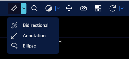
You can use the `ohif.splitButton` type to build a button with extra tools in the dropdown.
- First you need to give your `primary` tool definition to the split button
- the `secondary` properties can be a simple arrow down (`chevron-down` icon)
- For adding the extra tools add them to the `items` list.
You can see below how `longitudinal` mode is using the available toolbarModule to create
`MeasurementTools` nested button
```js
// modes/longitudinal/src/toolbarButtons.js
{
id: 'MeasurementTools',
type: 'ohif.splitButton',
props: {
groupId: 'MeasurementTools',
isRadio: true,
primary: {
id: 'Length',
icon: 'tool-length',
label: 'Length',
type: 'tool',
commandOptions: {
toolName: 'Length',
}
},
secondary: {
icon: 'chevron-down',
label: '',
isActive: true,
tooltip: 'More Measure Tools',
},
items: [
// Length tool
{
id: 'Length',
icon: 'tool-length',
label: 'Length',
type: 'tool',
commandOptions: {
toolName: 'Length',
}
},
// Bidirectional tool
{
id: 'Bidirectional',
icon: 'tool-bidirectional',
label: 'Length',
type: 'tool',
commandOptions: {
toolName: 'Bidirectional',
}
},
// Ellipse tool
{
id: 'EllipticalRoi',
icon: 'tool-elipse',
label: 'Ellipse',
type: 'tool',
commandOptions: {
toolName: 'EllipticalRoi',
}
},
],
},
}
```